When you land on a website or open a mobile app, the first thing that captures your attention isn’t the text—it’s the colors. Designers use colors intentionally to trigger emotions, guide users, and reinforce branding. This is where color psychology in digital design plays a crucial role. By understanding how different shades affect perception, brands can create designs that not only look appealing but also drive user action.
What is Color Psychology?
Color psychology studies how colors impact human emotions, thoughts, and behavior. From calming blues to energetic reds, each hue communicates a message. In the context of color psychology in digital design, these associations are applied strategically to websites, apps, and branding materials to shape user experiences.
Why Color Psychology Matters in Digital Design
Colors are more than decoration—they influence decisions. Here’s why color psychology in digital design is important:
- First impressions: Users form opinions about websites within seconds, often based on color.
- Emotional connection: Colors trigger moods that align with brand personality.
- Conversion impact: Button colors affect click-through rates and overall engagement.
- Brand recognition: Consistent use of colors reinforces identity.
By mastering color psychology in digital design, brands can communicate effectively without saying a word.
Common Color Meanings in Digital Design
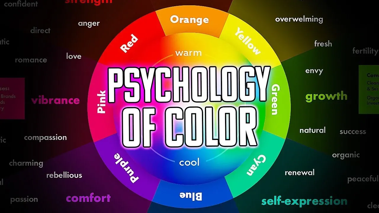
Understanding basic color associations is key to applying color psychology in digital design effectively:
- Red: Passion, urgency, excitement—often used in sales or CTAs.
- Blue: Trust, calmness, stability—popular in finance and healthcare industries.
- Yellow: Optimism, warmth, creativity—commonly used in lifestyle or food brands.
- Green: Growth, health, harmony—favored in eco-friendly or wellness platforms.
- Purple: Luxury, wisdom, creativity—used in beauty and high-end services.
- Black: Elegance, sophistication, power—applied in luxury or tech websites.
- White: Purity, simplicity, minimalism—common in modern web design.
These psychological effects form the foundation of color psychology across industries.
Practical Applications of Color Psychology in Digital Design
1. Call-to-Action (CTA) Buttons
The color of a CTA button can influence whether users click or scroll past. For example, red buttons create urgency, while green signals “go.” Understanding color psychology helps optimize conversions.
2. Backgrounds and Layouts
Soft, muted backgrounds allow text and visuals to stand out. Meanwhile, bold backgrounds convey energy. Designers rely on color psychology to balance usability with aesthetics.
3. Branding and Identity
Strong color choices ensure memorability. Think of Coca-Cola’s red or Facebook’s blue. These brands apply color psychology in digital design consistently to build recognition.
4. Accessibility and Inclusivity
Designers must consider how colorblind users perceive palettes. Contrast is crucial for readability. This highlights the importance of thoughtful color psychology for universal usability.
5. Emotional Triggers in UX
Colors can reduce bounce rates by making users feel comfortable. For example, a meditation app may use cool blues and greens to encourage relaxation—an excellent demonstration of color psychology.
Case Studies in Color Psychology
Example 1: E-Commerce Conversions
An online fashion store switched its “Buy Now” button from gray to red. The result? A 21% increase in conversions. This proves how color psychology can directly impact business results.
Example 2: Healthcare Platforms
Hospitals often use blue tones to instill trust and professionalism. This practical use of color psychology reassures patients and builds credibility.
Example 3: Luxury Branding
High-end watch brands frequently use black and gold. These shades evoke sophistication, reinforcing the premium feel. Again, color psychology in digital design aligns with user expectations.
Tools for Implementing Color Psychology
Designers can leverage tools to create palettes based on color psychology:
- Adobe Color Wheel (create harmonized palettes)
- Coolors.co (auto-generate color schemes)
- Canva Color Wheel (explore combinations and meanings)
- Material Design Colors (UI-friendly palettes)
These resources simplify the process of applying color psychology effectively.
Future Trends in Color Psychology for Digital Design
As digital experiences evolve, so does color usage. Here are some upcoming trends in color psychology
- Dark mode: Popular for reducing eye strain, it changes how colors appear.
- Neon and vibrant palettes: Emerging in tech startups for futuristic appeal.
- AI-driven color selection: Tools that suggest palettes based on user data.
- Sustainability-inspired colors: Natural, earthy tones are gaining popularity.
Mistakes to Avoid with Color Psychology
While powerful, color psychology can be misused. Designers should avoid:
- Using too many conflicting colors.
- Ignoring accessibility standards.
- Following trends without considering audience psychology.
Avoiding these errors ensures that color psychology enhances, not harms, user experience.
Conclusion
Colors are not just decorative—they are strategic tools that influence emotions, decisions, and perceptions. By understanding color psychology in digital design, businesses can create websites and apps that resonate deeply with users. From choosing the right CTA color to building a strong brand identity, color choices shape digital experiences in powerful ways. When applied thoughtfully, color psychology has the potential to improve engagement, trust, and long-term customer loyalty.


