
Design is more than shapes, layouts, and fonts it’s about creating an emotional connection with the audience. One of the most powerful yet subtle tools in design is color. Understanding how color psychology affects design can transform the way brands, websites, and marketing campaigns communicate with people.
Colors are not just decorative; they carry meaning, evoke feelings, and guide decisions. In this guide, we’ll explore the psychology of color and its role in effective design.
What Is Color Psychology?
Color psychology studies how colors influence human thoughts, emotions, and behaviors. For centuries, marketers, artists, and designers have used color strategically to trigger specific reactions. Knowing how color psychology affects design helps businesses and creators align visuals with desired outcomes, from building trust to driving conversions.
Why Color Matters in Design
Design without intentional color choices can feel flat or confusing. Colors create mood, establish brand identity, and make content more memorable. For example, research shows that people form first impressions of products or websites within seconds, and up to 90% of that judgment can be based on color.
That’s why how color psychology affects design is crucial knowledge for web designers, marketers, and small business owners alike.
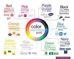
The Meaning of Common Colors in Design
When learning how color psychology affects design, it’s helpful to understand the general associations people have with different colors:
-
Red – Energy, passion, urgency. Often used in sales or food branding.
-
Blue – Trust, stability, calmness. Popular for corporate and financial brands.
-
Green – Growth, health, balance. Common in wellness and eco-friendly businesses.
-
Yellow – Optimism, warmth, creativity. Works well for attention-grabbing visuals.
-
Purple – Luxury, creativity, spirituality. Often used in beauty and premium products.
-
Orange – Enthusiasm, friendliness, excitement. Effective for calls-to-action.
-
Black – Power, sophistication, elegance. A staple in luxury branding.
-
White – Simplicity, purity, cleanliness. Frequently used in minimalistic designs.
Designers use these associations to create harmony between visuals and brand identity.
How Color Psychology Affects Design in Branding
A brand’s color palette is one of its most recognizable features. Think of Coca-Cola’s red, Facebook’s blue, or Starbucks’ green. These companies understand how color psychology affects design and use it consistently to reinforce their values and image.
For small businesses, choosing the right colors can:
-
Set you apart from competitors.
-
Influence customer trust and loyalty.
-
Create an emotional bond with your target audience.
How Color Psychology Affects Design in Marketing
Colors don’t just influence recognition they drive actions. For example:
-
Red “Buy Now” buttons often increase urgency and conversions.
-
Blue tones in websites make users feel secure during online transactions.
-
Green labels suggest eco-friendliness, making products more appealing to conscious consumers.
By applying how color psychology affects design, marketers can optimize visuals for engagement and sales.
Cultural Differences in Color Perception
It’s important to note that color meanings vary across cultures. While white represents purity in Western countries, it can symbolize mourning in parts of Asia. Anyone studying how color psychology affects design should consider cultural contexts when targeting global audiences.
Best Practices for Using Color Psychology in Design
To apply color psychology effectively, follow these tips:
-
Stay Consistent – Use the same color palette across your website, social media, and marketing materials.
-
Balance Contrast – Ensure readability by pairing contrasting text and background colors.
-
Limit Your Palette – Stick to 2–3 main colors with supporting neutrals to avoid overwhelming users.
-
Test and Analyze – Use A/B testing to see how different color choices affect conversions.
-
Align With Emotions – Choose colors that reflect your brand’s tone, whether calming, energetic, or professional.
These practices ensure that how color psychology affects design works in your favor, rather than confusing or alienating users.
Common Mistakes to Avoid
Even with good intentions, misuse of color can harm a design. Avoid:
-
Using too many bright or clashing colors.
-
Ignoring accessibility (low contrast can make text unreadable).
-
Choosing colors based only on personal preference instead of user psychology.
Understanding how color psychology affects design helps prevent these mistakes.
Final Thoughts
Colors are more than decoration they are a language of emotions and perception. By learning how color psychology affects design, businesses and designers can craft visuals that connect with audiences, strengthen branding, and influence behavior.
From choosing the right palette for a new website to designing effective marketing campaigns, color psychology is a tool every creative professional should master. The right shade can inspire trust, trigger excitement, or encourage action—all with just a glance.